
दोस्तों, जब भी दो products, दो teams, या दो time periods की sales side-by-side compare करनी हो — तो normal bar chart काम तो करता है, लेकिन देखने में उतना impressive नहीं लगता। आज हम सीखेंगे Excel mein Bidirectional Bar Chart kaise banaye — एक ऐसा comparison chart जो दोनों data series को आमने-सामने दिखाता है, बिल्कुल mirror की तरह। यह chart किसी भी Dashboard या Presentation में instantly professional और eye-catching लगता है।
इस chart में एक series left side में जाती है और दूसरी right side में — इसीलिए इसे Bidirectional यानी दो दिशाओं वाला chart कहते हैं। चलिए step-by-step बनाते हैं।

Table of Contents
Bidirectional Bar Chart क्या है और क्यों Use करें?
Normal Clustered Bar Chart में दोनों bars एक ही direction में जाती हैं — left से right। लेकिन Bidirectional Chart में एक series left की तरफ जाती है और दूसरी right की तरफ। Center में Month labels होते हैं — और दोनों sides पर data bars फैली रहती हैं। आप Month labels को अपनी आवश्यकता अनुसार Left-Right कर सकते है।
यह chart इन situations में सबसे ज्यादा effective है:
- 🔵 Product A vs Product B — monthly sales comparison
- 🟣 Male vs Female — population या survey data
- 🟢 Target vs Actual — performance comparison
- 🟠 Last Year vs This Year — year-on-year comparison
- 🔴 Two Teams या Branches — performance head-to-head
💡 Normal Chart से क्यों बेहतर? Normal clustered chart में दोनों bars एक-दूसरे के बगल में होती हैं — comparison करना mental effort लेता है। Bidirectional chart में दोनों literally आमने-सामने होती हैं — comparison instantly होता है।

Data Setup करें
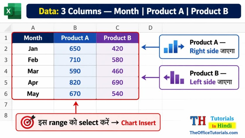
सबसे पहले अपना data organize करें। हमारे example में 5 महीनों का Product A और Product B का Sales data है:
| Month | Product A (Sales ₹) | Product B (Sales ₹) |
|---|---|---|
| Jan | 650 | 420 |
| Feb | 710 | 580 |
| Mar | 480 | 630 |
| Apr | 760 | 510 |
| May | 540 | 690 |
Data तीन columns में होना चाहिए — Month, और दोनों products/series के values। कोई blank row नहीं होनी चाहिए। इसी data से हम Bidirectional Chart बनाएंगे।
Clustered Bar Chart Insert करें
Step to Apply:
- Data range select करें — A1:C6 (Month + दोनों products, headers सहित)।
- Insert Tab पर जाएं।
- Insert Column or Bar Chart icon पर click करें।
- 2-D Bar section में Clustered Bar select करें।
- Chart sheet पर आ जाएगा — इसे appropriate जगह drag करें।
⚠️ ध्यान दें: हमें Bar Chart चाहिए — Column Chart नहीं। Bar Chart horizontal होता है (bars बाईं से दाईं तरफ)। Column Chart vertical होता है (bars नीचे से ऊपर)। Insert menu में दोनों अलग options हैं।

Secondary Axis Add करें — यही है Bidirectional की असली Trick!
अभी chart में दोनों series एक ही direction में हैं। Product B को opposite direction में करने के लिए उसे Secondary Axis पर डालना होगा।
Step to Apply:
- Chart के अंदर Product B की कोई भी bar पर click करें।
- Ctrl+1 press करें — Format Data Series panel खुलेगा।
- Series Options में “Secondary Axis” radio button select करें।
- Panel close करें।
अब chart में दोनों series अलग-अलग axes पर हैं — एक top पर, एक bottom पर। Chart के ऊपर और नीचे दोनों जगह axis numbers दिखेंगे।

दोनों Axes Format करें — Reverse Order Magic
Secondary Axis को reverse करने से ही chart bidirectional बनता है। यह सबसे important step है।
Top Axis (Secondary) — Reverse करें
Step to Apply:
- Chart के ऊपर वाले axis (Secondary) पर click करें।
- Ctrl+1 press करें।
- Minimum:
-800type करें (Fixed)। - Maximum:
800type करें (Fixed)। - नीचे scroll करें — “Values in Reverse Order” checkbox tick करें।
- Panel close करें।

Bottom Axis (Primary) — Same Values, No Reverse
Step to Apply:
- Chart के नीचे वाले axis (Primary) पर click करें।
- Ctrl+1 press करें।
- Minimum:
-800type करें (Fixed)। - Maximum:
800type करें (Fixed)। - “Values in Reverse Order” — इस बार tick नहीं करना — OFF रखें।
- Panel close करें।

🎯 Logic समझें: Secondary Axis reverse होने से Product B की bars left direction में जाएंगी। Primary Axis same direction में रहने से Product A की bars right direction में रहेंगी। यही bidirectional effect है!
Axis Value कैसे Choose करें? — यह जरूर पढ़ें
Transcript में Min = -800 और Max = 800 use किया — लेकिन यह value आपके data के हिसाब से अलग हो सकती है। गलत value डालने पर chart proportions खराब हो जाएंगे।
Axis Value Choose करने का सही तरीका:
| Step | क्या करें | Example |
|---|---|---|
| 1. Max Value Find करें | किसी empty cell में =MAX(B2:C6) type करें | Result: 760 |
| 2. Round Up करें | Max value से थोड़ा ऊपर का round number लें | 760 → 800 ✅ |
| 3. Same दोनों Axes में | Primary और Secondary — दोनों में same value डालें | Min: -800, Max: 800 |
| 4. Min = Negative Max | Minimum हमेशा Maximum का negative होगा | Max=800 → Min= -800 |
🎯 Rule of Thumb: Data में सबसे बड़ी value देखें — उससे 10-20% ज्यादा round number लें। जैसे max value 650 है तो 700 या 750 लें। बहुत ज्यादा value लेने पर bars छोटी दिखेंगी, बहुत कम लेने पर chart cut-off दिखेगा।
अलग-अलग Data Ranges के लिए Axis Values:
| Data Range | Suggested Max Value | Min Value |
|---|---|---|
| 0 – 500 | 600 | -600 |
| 0 – 800 | 1000 | -1000 |
| 0 – 5,000 | 6,000 | -6,000 |
| 0 – 50,000 | 60,000 | -60,000 |
| 0 – 1,00,000 | 1,20,000 | -1,20,000 |

Vertical Axis (Month Labels) को Left Side में Align करें
Bidirectional chart बनने के बाद Month labels (Jan, Feb, Mar…) chart के बीच में दिखते हैं जो bars को पढ़ने में confusion देता है। इन्हें left side पर shift करना है ताकि chart clean और readable लगे।
Step to Apply:
- Chart के अंदर Vertical Axis (Month labels) पर click करें।
- Ctrl+1 press करें — Format Axis panel खुलेगा।
- Labels section में जाएं।
- Label Position dropdown में “Low” select करें — labels left side में align हो जाएंगे।
- अब Fill section में जाएं → No Fill करें।
- Line section में जाएं → No Line करें।
- Panel close करें।

💡 “Low” क्यों? Bidirectional chart में Secondary Axis reverse होने की वजह से vertical axis का default position bars के बीच में आ जाता है — जो confusing लगता है। “Low” select करने से Month labels chart के left side में आ जाते हैं — chart पढ़ना आसान हो जाता है और layout clean दिखता है।
Gap Width घटाएं और Data Labels Add करें
Gap Width कम करें — Bars मोटी और सुंदर बनेंगी
Step to Apply:
- Chart के अंदर Product A की bars पर click करें → Ctrl+1।
- Series Options में Gap Width को 182% से घटाकर 40% करें।
- Panel close करें।
- अब Product B की bars पर भी same process — Gap Width = 40% करें।

💡 Gap Width क्या है? Gap Width bars के बीच की space को control करती है। ज्यादा value = पतली bars, ज्यादा space। कम value = मोटी bars, कम space। 40% एक balanced और professional look देता है। आप 30-50% के बीच अपनी पसंद से choose करें।
Data Labels Add करें
Step to Apply:
- Chart पर click करें → + (Plus) icon पर click करें।
- या Chart Design Tab → Add Chart Element → Data Labels पर जाएं।
- Product A bars select करें → “Inside End” select करें।
- Data Labels पर click करें → Home Tab से Font Color = White, Bold ON, Size = 10-11।
- Product B bars पर भी same process repeat करें।

Final Touch — Chart Clean और Polish करें
Gridlines Delete करें
- Chart के अंदर Gridlines (horizontal lines) पर click करें।
- Delete key press करें।
Chart Title Delete करें
- Chart Title पर click करें → Delete करें।
- या Chart Title को double-click करके अपना title type करें — जैसे “Product A vs Product B — Monthly Sales”।
Chart Resize करें
- Chart के corners को drag करके appropriate size दें।
- Dashboard में fit करें।

Verify करें — Chart सही बना है?
Chart बनने के बाद इन points से check करें:
- Product A की bars right side में जानी चाहिए।
- Product B की bars left side में जानी चाहिए।
- Month labels (Jan, Feb…) दोनों bars के बीच center में होने चाहिए।
- दोनों bars की length proportional हो — बड़ी value = लंबी bar।
- Data Labels bars के अंदर clearly दिख रहे हों।
- Data बदलो — chart automatically update हो।

🌟 अगर Product B की bars right जा रही हैं — left नहीं? Secondary Axis पर “Values in Reverse Order” tick नहीं हुई। ऊपर वाले axis पर click → Ctrl+1 → Values in Reverse Order tick करें।
Real Life में Bidirectional Chart कहाँ Use करें?
यह chart सिर्फ देखने में अच्छा नहीं है — practically बहुत useful है:
- Sales Dashboard: Region-wise या Product-wise monthly comparison — Management को एक नज़र में सब दिख जाए।
- HR Analytics: Male vs Female employee count by department।
- Population Data: Age-wise population comparison (Population Pyramid)।
- Marketing: Two campaigns का monthly performance head-to-head।
- Finance: Budget vs Actual expenses — monthly।
Excel में और advanced charts बनाना सीखना चाहते हैं? देखें: Excel में Cylinder Chart — Target vs Actual और Excel में Chart कैसे बनाएं — Complete Guide।
Bidirectional charts के बारे में Microsoft की official documentation: Microsoft Support — Excel Chart Types।

निष्कर्ष
तो दोस्तों, आज हमने step-by-step सीखा कि Excel mein Bidirectional Bar Chart kaise banaye — Secondary Axis, Values in Reverse Order, और Axis Value calculation — सब कुछ detail में cover किया। यह chart बनाने में थोड़ा practice लगता है, लेकिन एक बार बन जाए तो किसी भी Dashboard या Presentation को instantly professional बना देता है।
और सबसे अच्छी बात — यह chart fully dynamic है। Data table में values बदलो — chart automatically update होगा। Monthly report बनानी हो तो बस data change करो, chart ready है।
नीचे comment जरूर करें — आपने यह chart किस data के साथ try किया? Axis value choose करने में कोई confusion आई? सब बताएं! और TheOfficeTutorials.com को bookmark करना न भूलें — Excel के ऐसे ही creative और practical chart tutorials यहाँ लगातार आते रहते हैं। 🙌
FAQ — अक्सर पूछे जाने वाले सवाल
Q1. दोनों bars same direction में जा रही हैं — Bidirectional नहीं बन रहा।
Secondary Axis add नहीं हुई। Product B की bar पर click करें → Ctrl+1 → Series Options → Secondary Axis select करें। फिर top axis (secondary) पर → Values in Reverse Order tick करें। इन दोनों steps के बिना bidirectional effect नहीं आएगा।
Q2. Month labels center में नहीं आ रहे — side पर हैं।
Vertical Axis (Month labels) पर click करें → Ctrl+1 → Labels section → Label Position → “Low” select करें। “Low” position bidirectional chart में labels को center area में रखता है।
Q3. Axis Value क्या डालूँ — मेरा data 400 से 800 के बीच है।
किसी empty cell में =MAX(अपनी data range) formula लिखें। Result देखें — उससे थोड़ा ऊपर round number लें। जैसे MAX = 760 है तो 800 लें। Primary और Secondary दोनों axes में same value डालें: Min = -800, Max = 800।
Q4. Bars बहुत पतली दिख रही हैं।
Gap Width बहुत ज्यादा है। दोनों series पर Ctrl+1 → Series Options → Gap Width को 40-50% तक कम करें। कम Gap Width = मोटी bars = better visual impact।
Q5. Data Labels bars के बाहर दिख रहे हैं — अंदर कैसे करें?
Data Labels select करें → Right-click → Format Data Labels → Label Position → “Inside End” select करें। फिर Home Tab से Font Color White करें ताकि bar के अंदर clearly दिखे।
Q6. क्या यह chart Excel के सभी versions में बनता है?
हाँ — Excel 2013, 2016, 2019, 2021 और Microsoft 365 सभी में यह technique काम करती है। Secondary Axis और Values in Reverse Order — दोनों features सभी versions में available हैं।
Q7. Primary और Secondary — दोनों Axes में Same Value क्यों डालना जरूरी है?
अगर दोनों axes की scale अलग-अलग हो तो bars की length misleading लगेगी — जैसे एक side की bar दूसरी से बड़ी दिखेगी जबकि value same हो। Same scale रखने से दोनों sides proportional और accurate comparison देती हैं।